Romeo Rossi
Italian Gastronomic House
About the project
“Romeo Rossi is a progressive and developing Italian company, a true connoisseur of Italian cuisine and the most colourful of the Italian culinary brands. We are not just a manufacturer, but a tireless seeker of new modalities, ingredients and flavour combinations.”
Full-cycle services
- Logotype Development
- Branding
- Packaging Design & Development
- Marketing Kit
- Catalogues & Printed products
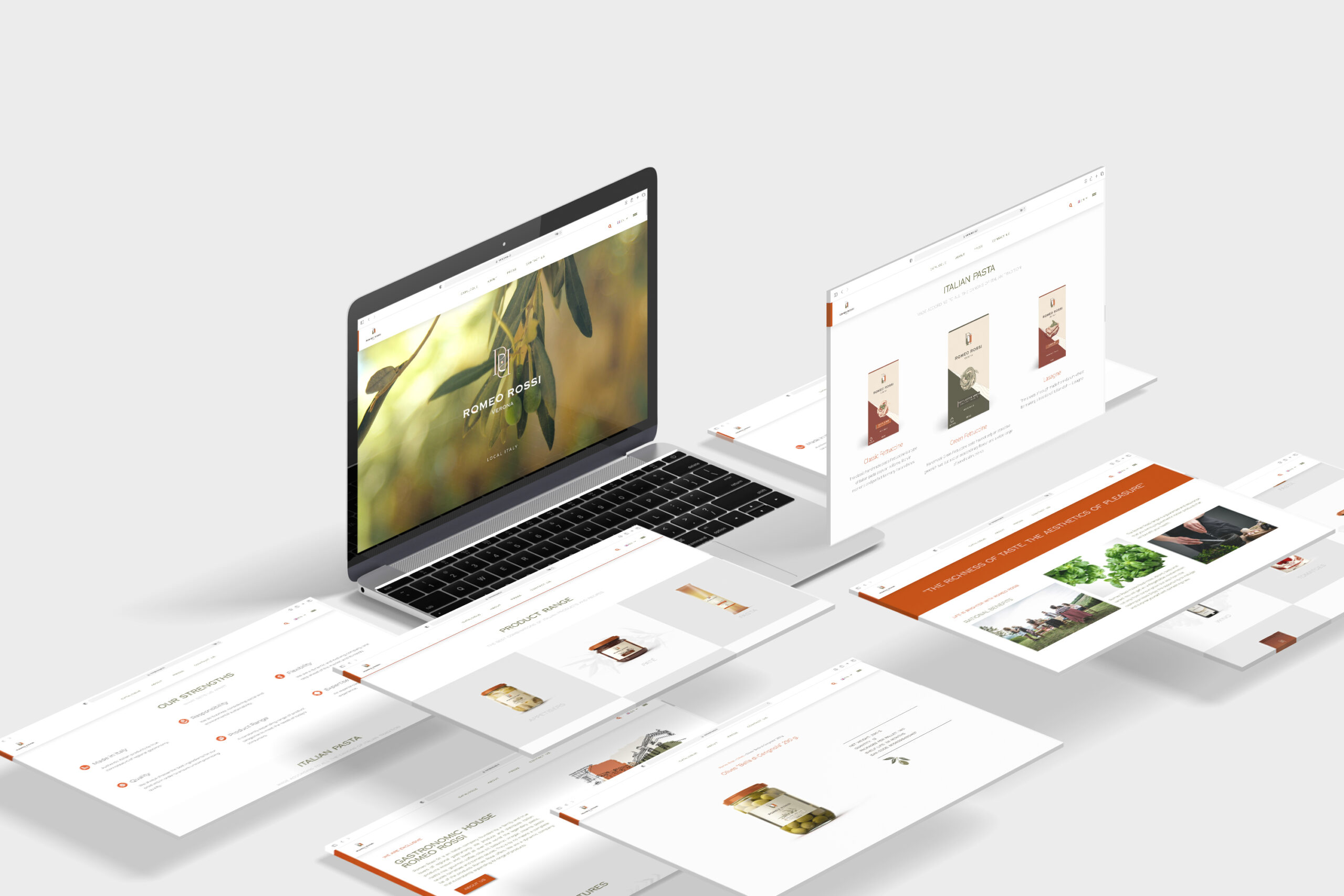
- Website Design & Development
- Social Media Marketing
“Riches of taste, aesthetics of pleasure”
Romeo RossiProject year: 2020-2021
Logotype design
The logo is based on Italian motives and brand values. The colours endlessly resemble the flag of Italy and are also the main colours of Italian cuisine. It is subtle, concise and meaningful.
We created a brand image that reflects the traditions of Italian cuisine, but at the same time look modern and appealing to the target audience.
As a result of a continuous visual exploration and intense communication with the client, we designed a new logo concept: two “R” letters overlapping and forming a shape of an Italian flag. Sophisticated and thin yet remarkable contrast shapes create a high-class feeling.


Branding
Terracotta and olive colours, chosen as Italian palette interpretation, reflect authentic and mature, nonetheless, vivid brand identity.
Copperplate is the main corporate typeface. Inspired by Trajan’s column inscription, the letters highlight the brand’s features of stability and consistency while drawing connections to Italy’s proud past. Copperplate Regular has a bold look and pops up noticeably both on small and large objects. Copperplate Light is more delicate while still alluring.
A small river named Duden flows by their place and supplies it with the necessary regelialia. It is a paradisematic country, in which roasted parts of sentences
Packaging Design
The packaging design gives a high-end feeling and sets an expectation of high quality.
We have developed unique illustrations to reflect the main ingredients of the product. The illustrations are one of the most valuable elements in packaging design, so consumers can immediately understand what they are buying.
The design of the labels is reminiscent of the columns, which is a reference point for the city of Verona, where the Romeo Rossi brand was born.
Packaging that your product deserves.


Wine Label Design
Our design team has developed a unique packaging line of Romeo Rossi wine consisting of 8 SKU. The packaging is based on the same restrained style and simplicity of the elements. The main component is an illustration of pouring the wine, which is complemented by embossing and applying a gold cover.


Website Design & Development